
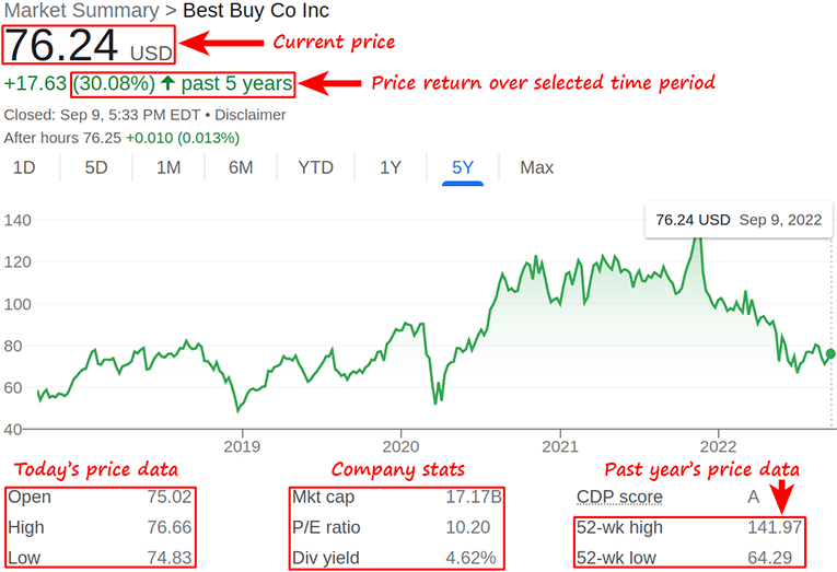
Understanding Stock Market Charts: Your First Step to Investing
The stock market can seem intimidating, especially when you're bombarded with complex charts and jargon. But understanding stock market charts is crucial for making informed investment decisions. This guide will break down the basics of reading stock charts, focusing on the essential elements that beginners need to know.
Why Learn to Read Stock Charts?
Stock charts provide a visual representation of a stock's price history. By analyzing these charts, you can gain insights into a stock's past performance and potentially predict its future movements. This knowledge can help you:
- Identify trends: Determine if a stock is trending upwards (bullish), downwards (bearish), or sideways (consolidating).
- Find entry and exit points: Recognize potential opportunities to buy low and sell high.
- Manage risk: Set stop-loss orders based on chart patterns to limit potential losses.
- Make informed decisions: Avoid relying solely on news headlines or gut feelings and instead base your decisions on data.
Basic Types of Stock Market Charts
Several types of charts are used in stock market analysis, but we'll focus on the most common and beginner-friendly:
Line Charts
Line charts are the simplest type of stock chart. They connect the closing prices of a stock over a specific period, forming a continuous line. While easy to understand, line charts offer limited information, primarily showing the overall trend.
Bar Charts
Bar charts provide more information than line charts. Each bar represents a specific time period (e.g., a day, week, or month) and shows the following data points:
- High: The highest price the stock reached during that period.
- Low: The lowest price the stock reached during that period.
- Open: The price at which the stock started trading during that period.
- Close: The price at which the stock finished trading during that period.
The bar itself represents the price range between the high and low, while a small horizontal line indicates the opening and closing prices. If the closing price is higher than the opening price, the bar is typically green (or white). If the closing price is lower than the opening price, the bar is typically red (or black).
Candlestick Charts
Candlestick charts are similar to bar charts but visually more appealing and easier to interpret. They also display the high, low, open, and close prices for a specific period. The "body" of the candlestick represents the range between the open and close prices. The "wicks" or "shadows" extending above and below the body represent the high and low prices for the period.
Like bar charts, candlesticks are typically colored green (or white) if the closing price is higher than the opening price, indicating a bullish (upward) trend. They are colored red (or black) if the closing price is lower than the opening price, indicating a bearish (downward) trend.
Key Elements of a Stock Chart
Beyond the type of chart, several elements provide valuable insights into a stock's behavior:
Timeframe
The timeframe refers to the period each bar or candlestick represents. Common timeframes include:
- Daily: Each bar represents one day of trading.
- Weekly: Each bar represents one week of trading.
- Monthly: Each bar represents one month of trading.
- Intraday: Each bar represents a shorter period, such as 5 minutes, 15 minutes, or 1 hour.
Choosing the right timeframe depends on your investment strategy. Short-term traders typically use intraday or daily charts, while long-term investors may prefer weekly or monthly charts.
Volume
Volume represents the number of shares traded during a specific period. It's usually displayed as a bar graph at the bottom of the chart. High volume indicates strong interest in the stock, while low volume suggests less interest. Volume can confirm trends and identify potential reversals.
Trends
Identifying trends is crucial for making informed investment decisions. A trend is the general direction in which a stock's price is moving.
- Uptrend: Characterized by higher highs and higher lows.
- Downtrend: Characterized by lower highs and lower lows.
- Sideways Trend (Consolidation): The price fluctuates within a range, without a clear upward or downward direction.
You can use trendlines to visually identify trends. A trendline is a line drawn connecting a series of highs (in a downtrend) or lows (in an uptrend).
Support and Resistance Levels
Support and resistance levels are price levels where the stock has historically struggled to move beyond. Support is a price level where the stock tends to find buying pressure, preventing it from falling further. Resistance is a price level where the stock tends to find selling pressure, preventing it from rising higher.
These levels are important because they can act as potential entry or exit points. For example, you might consider buying a stock near its support level or selling it near its resistance level.
Basic Chart Patterns
Chart patterns are specific formations that appear on stock charts and can indicate potential future price movements. Here are a few basic patterns:
Head and Shoulders
The head and shoulders pattern is a bearish reversal pattern that signals a potential downtrend. It consists of three peaks: a left shoulder, a head (the highest peak), and a right shoulder (similar in height to the left shoulder). A "neckline" connects the lows between the shoulders. A break below the neckline confirms the pattern and suggests a potential price decline.
Double Top and Double Bottom
A double top is a bearish reversal pattern that forms when a stock price reaches a peak twice, with a trough in between. A break below the trough confirms the pattern and suggests a potential downtrend. A double bottom is a bullish reversal pattern that forms when a stock price reaches a low twice, with a peak in between. A break above the peak confirms the pattern and suggests a potential uptrend.
Triangles
Triangles are continuation patterns that suggest the existing trend is likely to continue. There are several types of triangles, including:
- Ascending Triangle: A bullish pattern with a flat top and a rising bottom.
- Descending Triangle: A bearish pattern with a flat bottom and a falling top.
- Symmetrical Triangle: A neutral pattern with converging trendlines.
Using Technical Indicators
Technical indicators are mathematical calculations based on a stock's price and volume data. They can provide additional insights into a stock's momentum, volatility, and trend strength. Here are a few commonly used indicators:
Moving Averages (MA)
Moving averages smooth out price fluctuations by calculating the average price over a specific period. Common moving average periods include 50 days, 100 days, and 200 days. Moving averages can help identify trends and potential support and resistance levels.
Relative Strength Index (RSI)
The RSI is a momentum oscillator that measures the speed and change of price movements. It ranges from 0 to 100. An RSI above 70 is considered overbought, suggesting the stock may be due for a pullback. An RSI below 30 is considered oversold, suggesting the stock may be due for a bounce.
Moving Average Convergence Divergence (MACD)
The MACD is a trend-following momentum indicator that shows the relationship between two moving averages of a stock's price. It consists of the MACD line, the signal line, and the histogram. Crossovers between the MACD line and the signal line can indicate potential buy or sell signals.
Practice and Further Learning
Reading stock market charts is a skill that requires practice. Start by familiarizing yourself with the basic chart types, elements, and patterns. Use online charting tools to analyze different stocks and experiment with different timeframes and indicators. Consider taking online courses or reading books on technical analysis to deepen your understanding. Remember to always conduct thorough research and consult with a financial advisor before making any investment decisions.

0 Comments